Good morning! Ardyth here with a quick and simple card with a surprise - you choose (well, at least let us know) the ending you prefer!
I started with the whole set of Blossoms dies. I taped them together on a white panel so that they wouldn't move when I ran them through my Big shot:
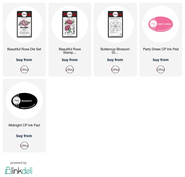
A Jillian Vance Design Products Used:

Follow A Jillian Vance Design here:
I started with the whole set of Blossoms dies. I taped them together on a white panel so that they wouldn't move when I ran them through my Big shot:
Here's how they came out. I held onto the panel to use for the final card.
I blended ink onto each blossom:
Then, before I put them back together, I spritzed them with water. I kept them apart so that the colours wouldn't contaminate each other. Although, thinking about it now, it may have been an interesting experiment!
I cut the panel with a Stitched Dot Rectangle and then flipped it over and covered the opening with Be Creative tape.
I turned it back over and laid the flowers back in.
I stamped my sentiment.
Now comes the choice! When I got to this stage, I couldn't decide whether to use black or white. The black is dramatic and really pops. The white is softer and prettier. Let us know in the comments below what you prefer!

Follow A Jillian Vance Design here:


6 comments:
+both are beautiful but I prefer the black for sure!!
Thank you for asking ... although both are attractive, I like the black.
Lovely cards, but I do prefer the black. Catches the eye more!
Black - pops more -- and I could so this design with other images behind the beautiful -- snowflake, butterfly, balloon -- options are limitless! Beautiful!
Well, I like them both. What works with the Black is the small black mat you used. What works with the white is you removed the black mat. I would want both in my stash because I match the cards with the person I’m sending them to. These cards (which I love, BTW), have two different personalities. I have dies I can do this with. I’m going to give it a try.
Well Ardyth, I can see why your decision was up in the air. They are both really nice and I am having a hard time choosing myself. I finally decided on the white - maybe because it appears to be the underdog at present? :-) Can't go wrong with either choice...
Post a Comment